
Five ways to tell the Star story.
Five design directions for the Star Foods website. Each one has all five pages: Home, About us, Business, Brands and Contact us. Open them on a laptop to see the full motion; they work on phones too.
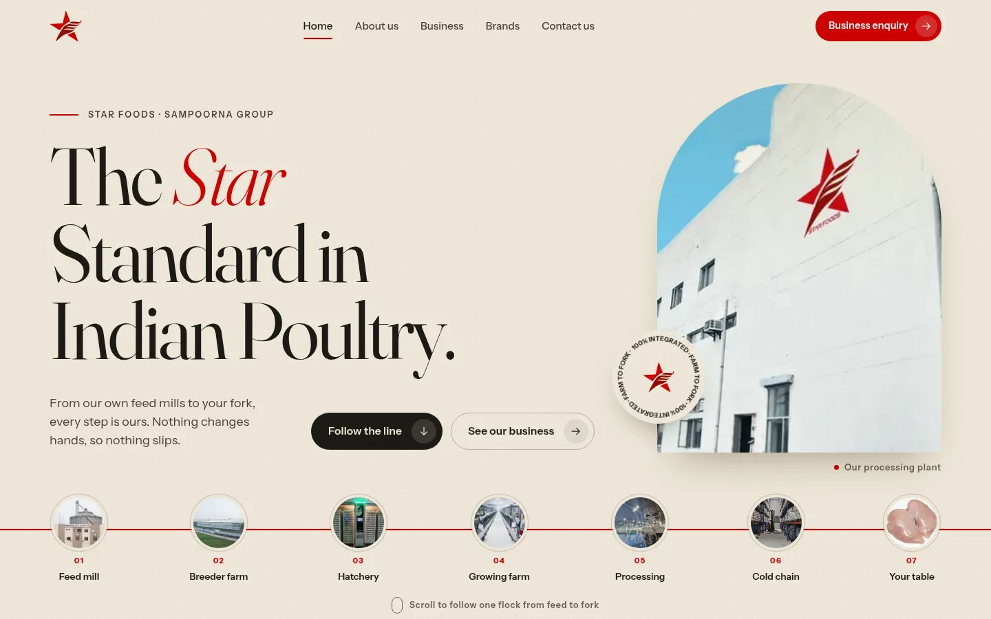
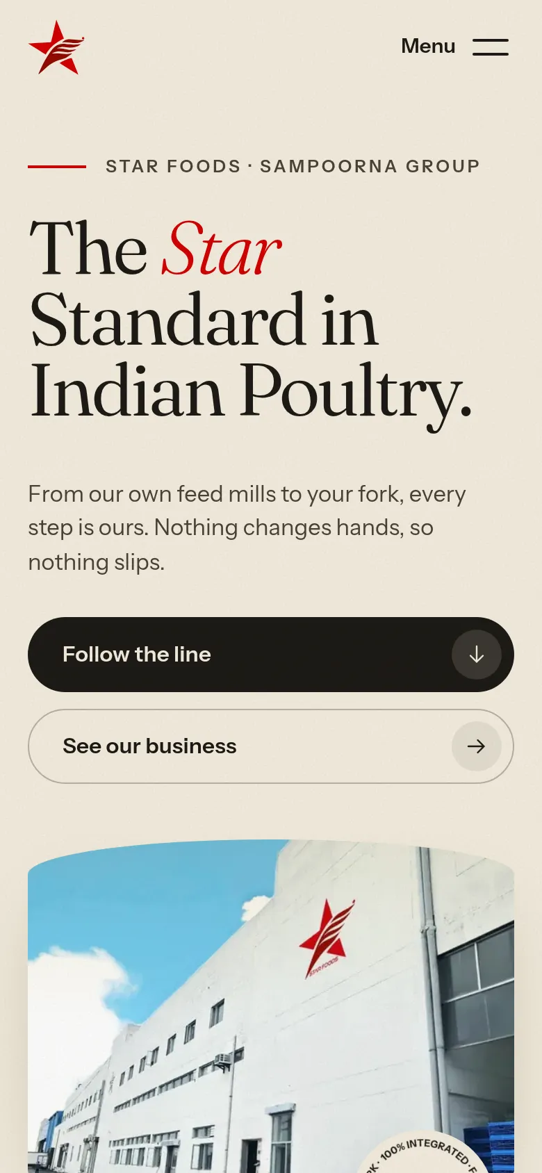
One Unbroken Line
Farm to fork, in one scroll. A red line runs from the feed mill to your table as you scroll.
What moves
- The homepage holds still and slides sideways through all 7 stages, feed mill to export.
- Numbers count up as each stage passes.
- Plant photos flip like a flipbook at processing.
- Between pages, the red line draws across the screen.
The look
Warm and natural: wheat, cream and field green, with the logo red as the only accent. A classic serif for headlines.
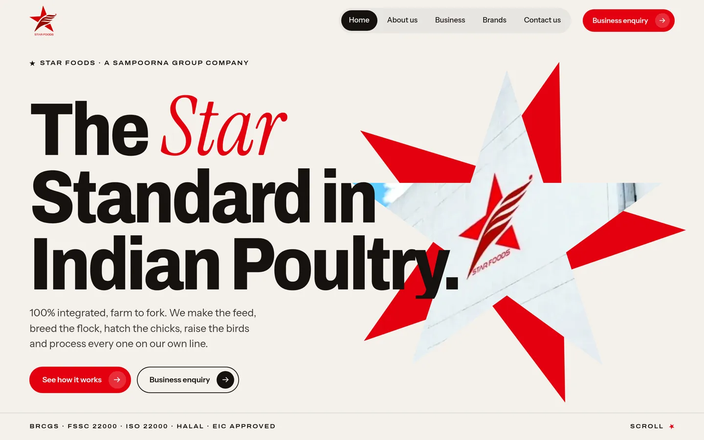
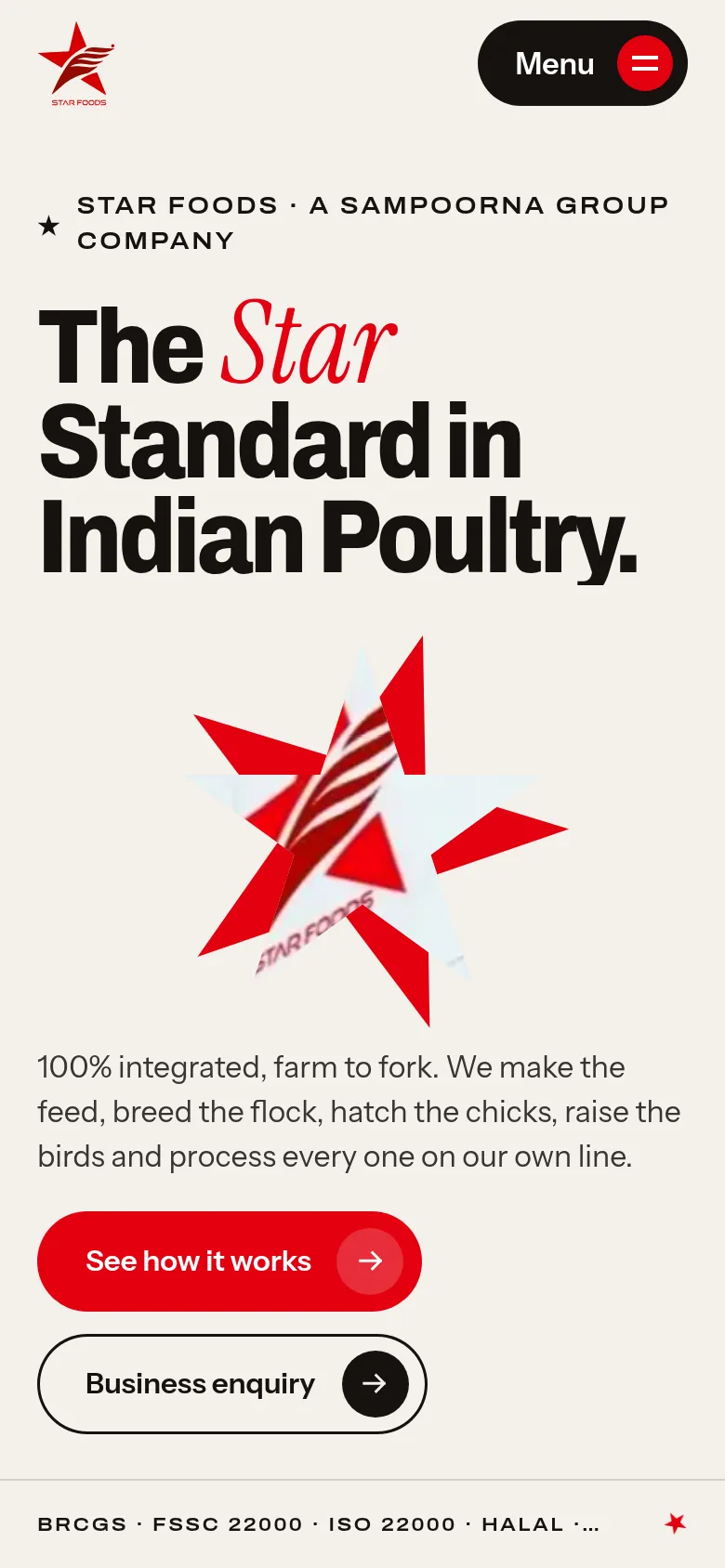
The Star Standard
Bold and editorial, like an annual report. The star from the logo frames every photo.
What moves
- The hero star grows and turns until the plant fills the screen.
- 147 stars light up, one for each lab test.
- The farm-to-fork chain slides sideways; a row of six stars turns red as you go.
- A red star opens and closes between pages.
The look
Warm paper, black ink and the logo red. Huge headlines with one red italic word, and giant figures.
Control Room
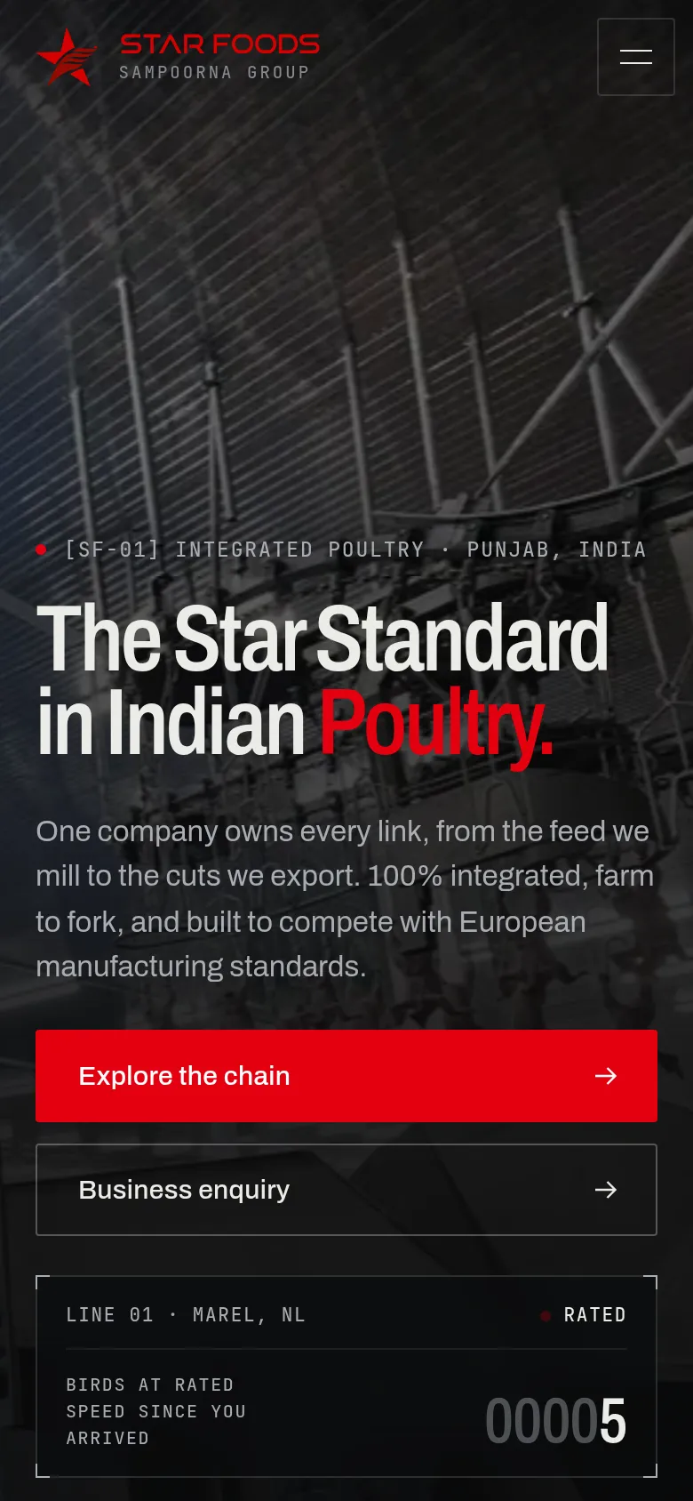
Dark and precise. The plant shown like a calibrated instrument, every number a live reading.
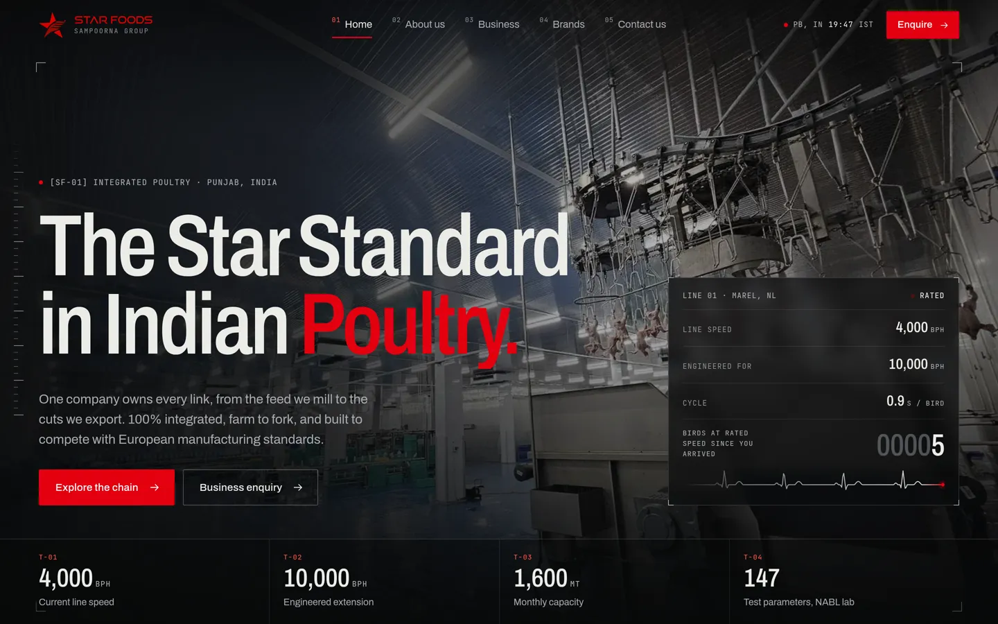
What moves
- A live panel ticks once per bird, at the line's 4,000 birds an hour.
- The chain fills like a pipeline, feed mill to export.
- Gauges for line speed, capacity and zero waste, and a grid of the 147 lab tests.
- Photos open from a thin slit; a curtain wipes between pages.
The look
Near-black and graphite with a fine engineering grid. Mono type for readings, and the logo red used only as a signal light.
The Red Thread
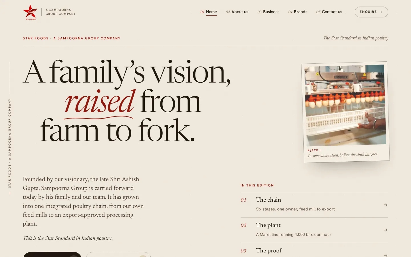
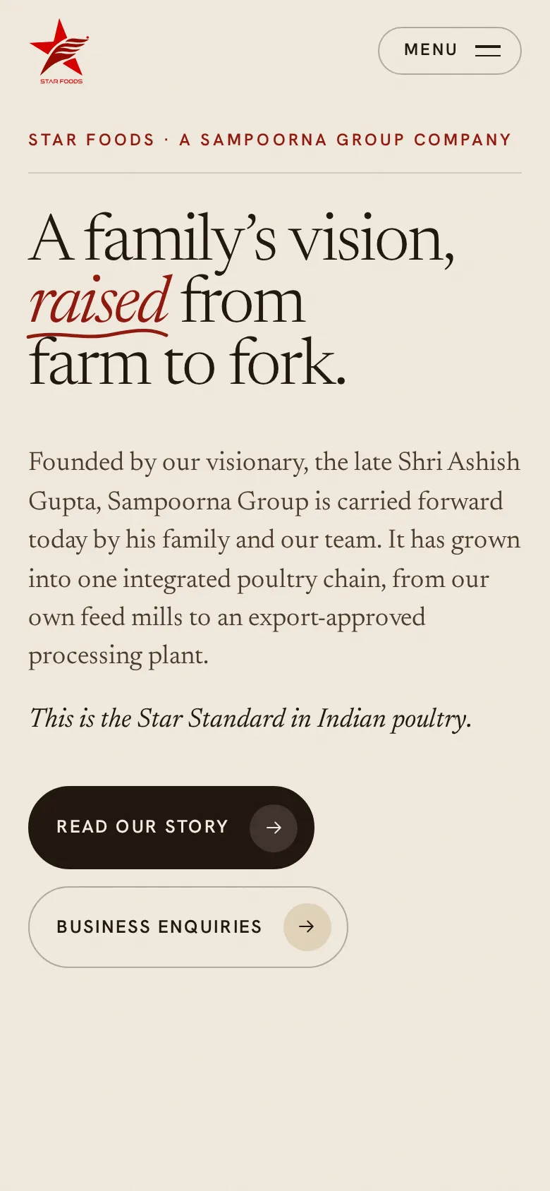
A family's story, set like a printed magazine. One red thread ties every stage together.
What moves
- Photos shown as numbered plates with captions, revealed as you scroll.
- On About, the timeline draws itself chapter by chapter.
- Each page ends with the thread drawing itself into the Star Foods star.
- A deep red page-turn between pages.
The look
Paper, ink, deep red and ochre. An elegant serif, generous space and a respectful founder section.
Specified
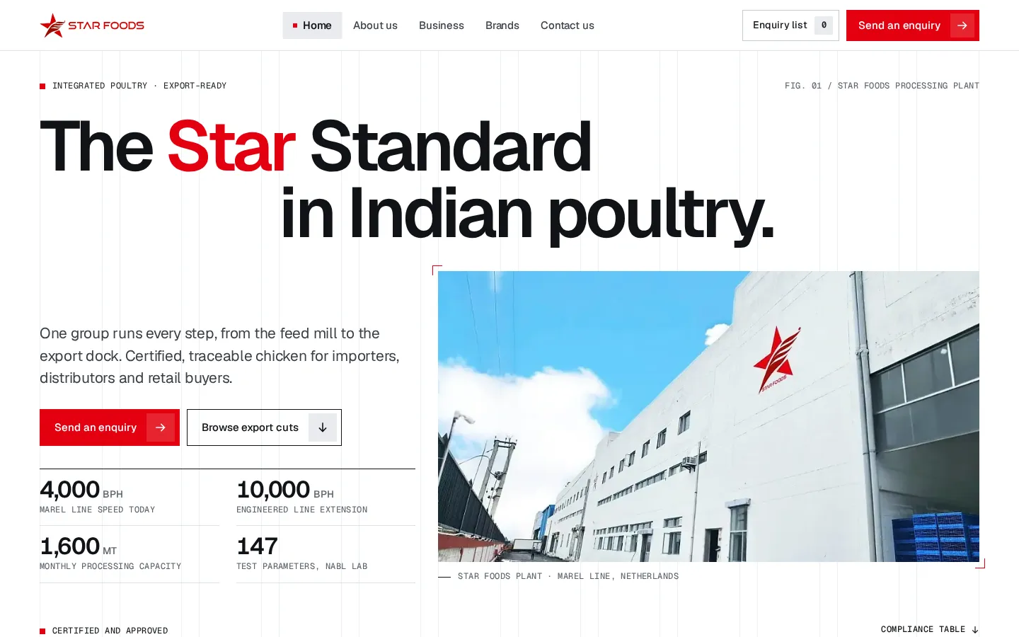
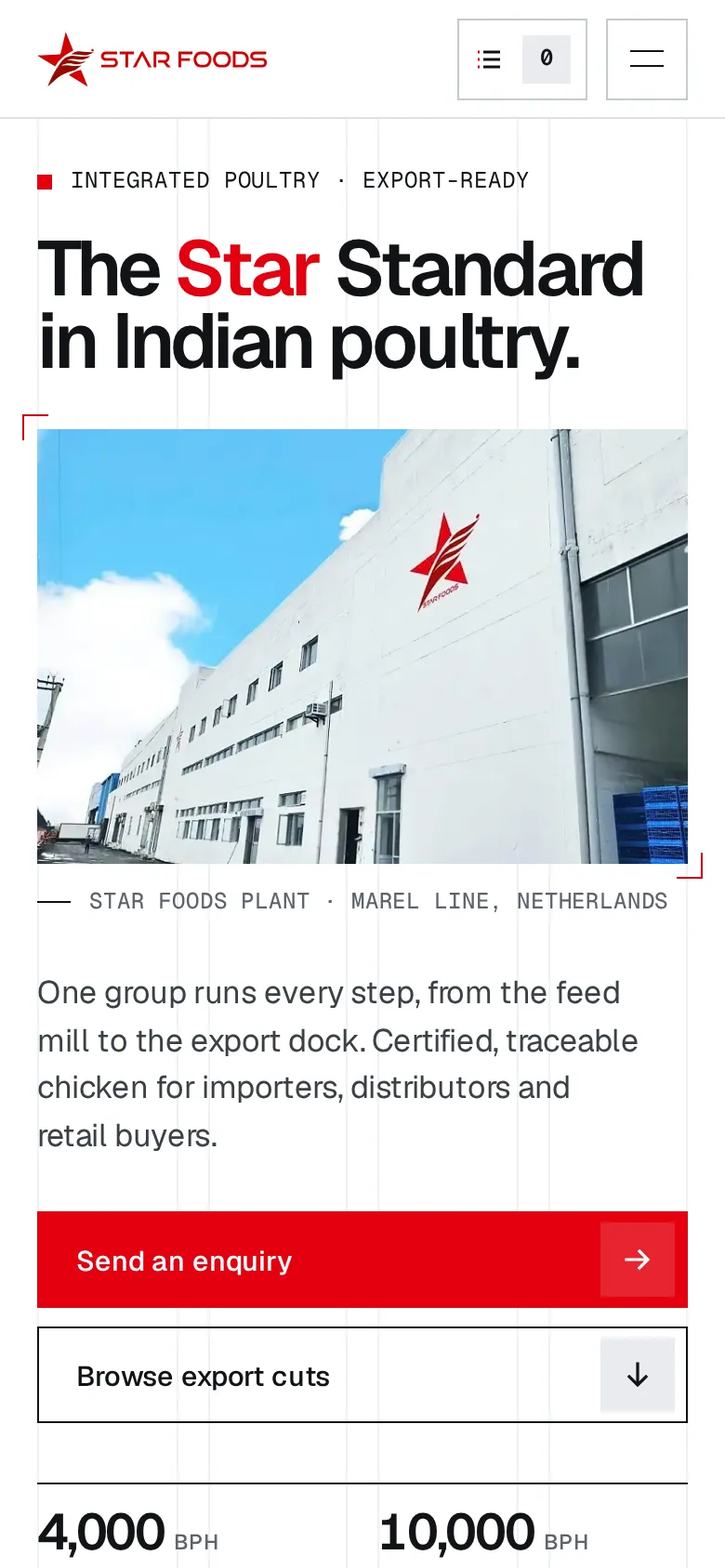
Made for export buyers. Clean, exact, and every section leads to an enquiry.
What moves
- A cut catalogue: filter by skin or boneless, and add cuts to an enquiry list.
- "I import" or "I distribute" rows open the enquiry form already filled in.
- A step-by-step view of the chain, from feed mill to export.
- A 12-column shutter between pages.
The look
White and cool grey on a visible Swiss grid, with the logo red used sparingly. Numbered figures, like a spec sheet.
Good to know
- All wording and numbers come from the Star Foods brochures. Your page flow and banner text can go straight in.
- Phone, email, address and the FSSAI number show as "to come" until we have them.
- The Brands page has two "Brand to come" slots.
- The enquiry forms work on the page but don't send anywhere yet.